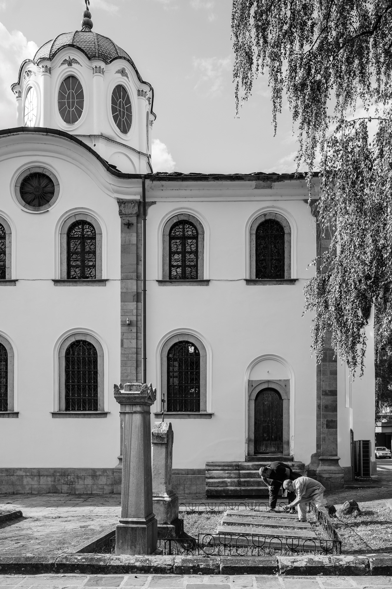
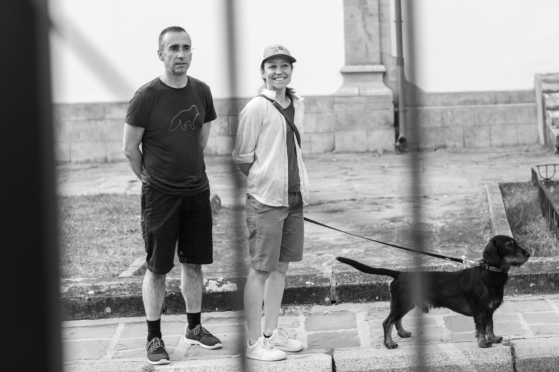
The Church of the Assumption of the Virgin Mary in Gabrovo and the gravestones John Neilson examined before the beginning of the meeting.
This meeting began before its official start.
On 23 July, “Stone, Letter, Place — Typocamp Visits Gabrovo” began precisely like this — even before the audience had taken their seats in the venue. John Neilson and participants in his masterclass stopped by the gravestones next to the "Sveta Bogoroditsa" Church, just across the street, and began reading the letters in stone: how they had been carved, how they sat within the material, what remained of the hand that made them, how time had changed the surface.
In this way, the evening’s theme connected with Gabrovo even before the first words were spoken — through existing traces in stone, memory and the urban environment.
The meeting was initiated by Capturing Creativity and led by Rosina Pencheva — founder of the platform and Homo Faber Ambassador for Bulgaria — together with Typo.bg, in partnership with the Municipality of Gabrovo, the Interactive Museum of Industry and the Bozhentsi Architectural and Historical Reserve Museum.

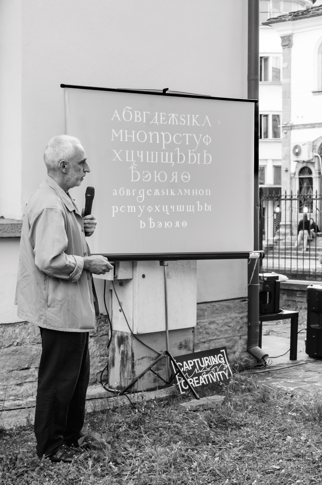
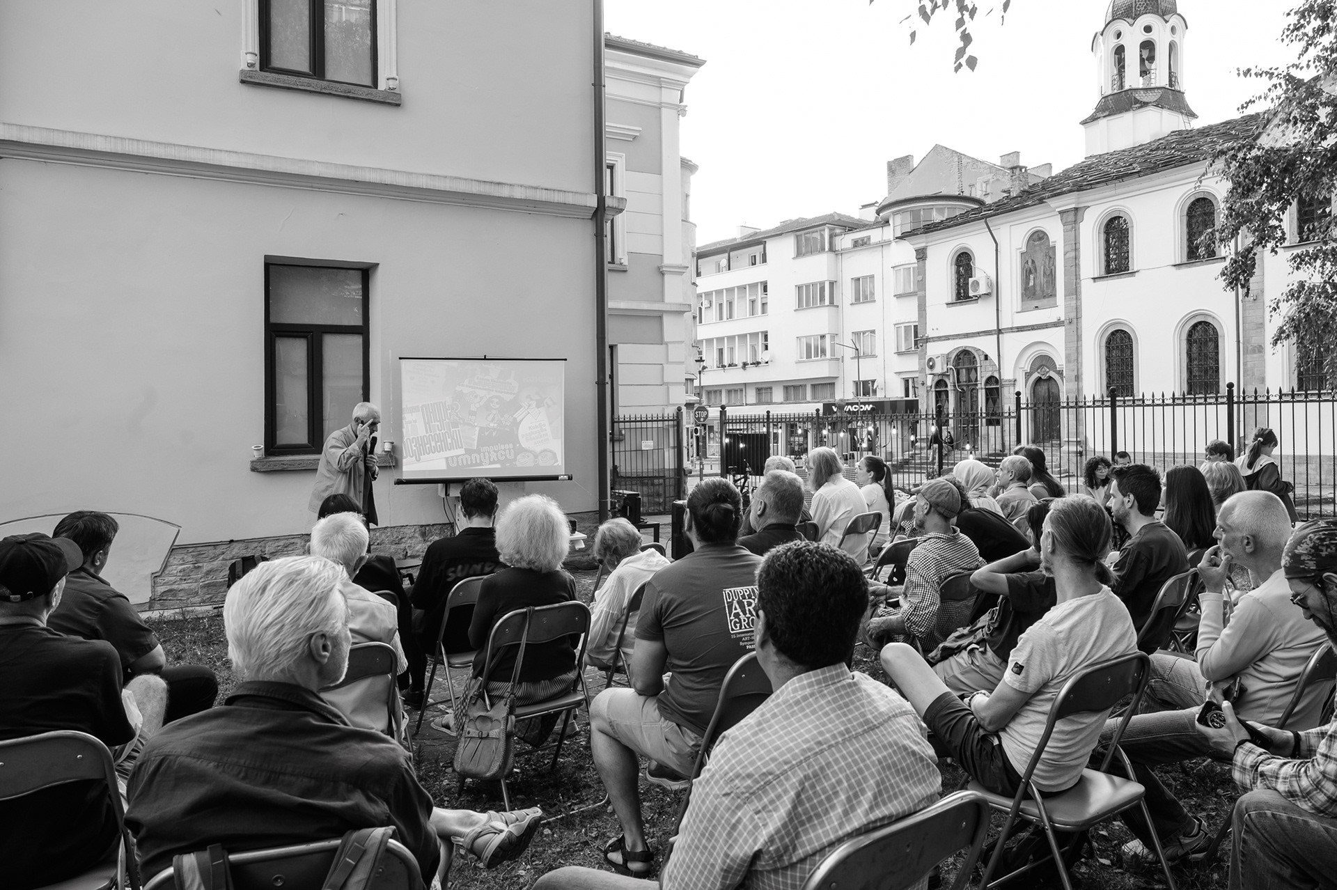
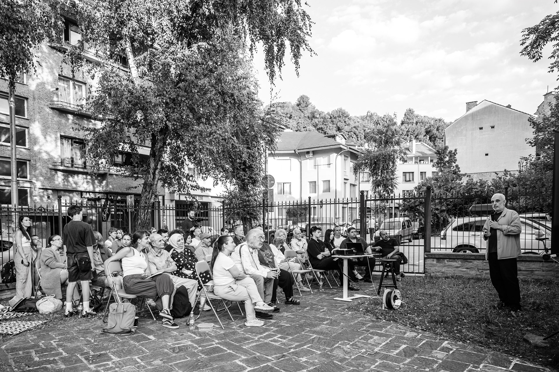
Boril Karaivanov presents the topic of the Bulgarian form of Cyrillic to the audience in the courtyard of the Interactive Museum of Industry.

Rosina Pencheva is a long-standing collaborator of Typo.bg in the visual documentation of its events, workshops and professional meetings. This work has introduced her to a specialised field — the world of letters, type design, calligraphy and rare practices in which writing is understood through hand, material and cultural memory.
For Capturing Creativity, this meeting was part of the platform’s ongoing work to open access to rare creative professions and to the knowledge behind them — knowledge of material, hand, time, place and mastery. In this sense, the connection with Homo Faber provided an important professional context: a perspective on craftsmanship as a contemporary practice that brings together heritage, authorship, material and a high level of execution.

Assoc. Prof. Dr Zaharina Petrova-Prodanova — lecturer in type, calligraphy and graphic design at New Bulgarian University — during Typocamp 2026: Stone Carving Lettering in Bozhentsi.
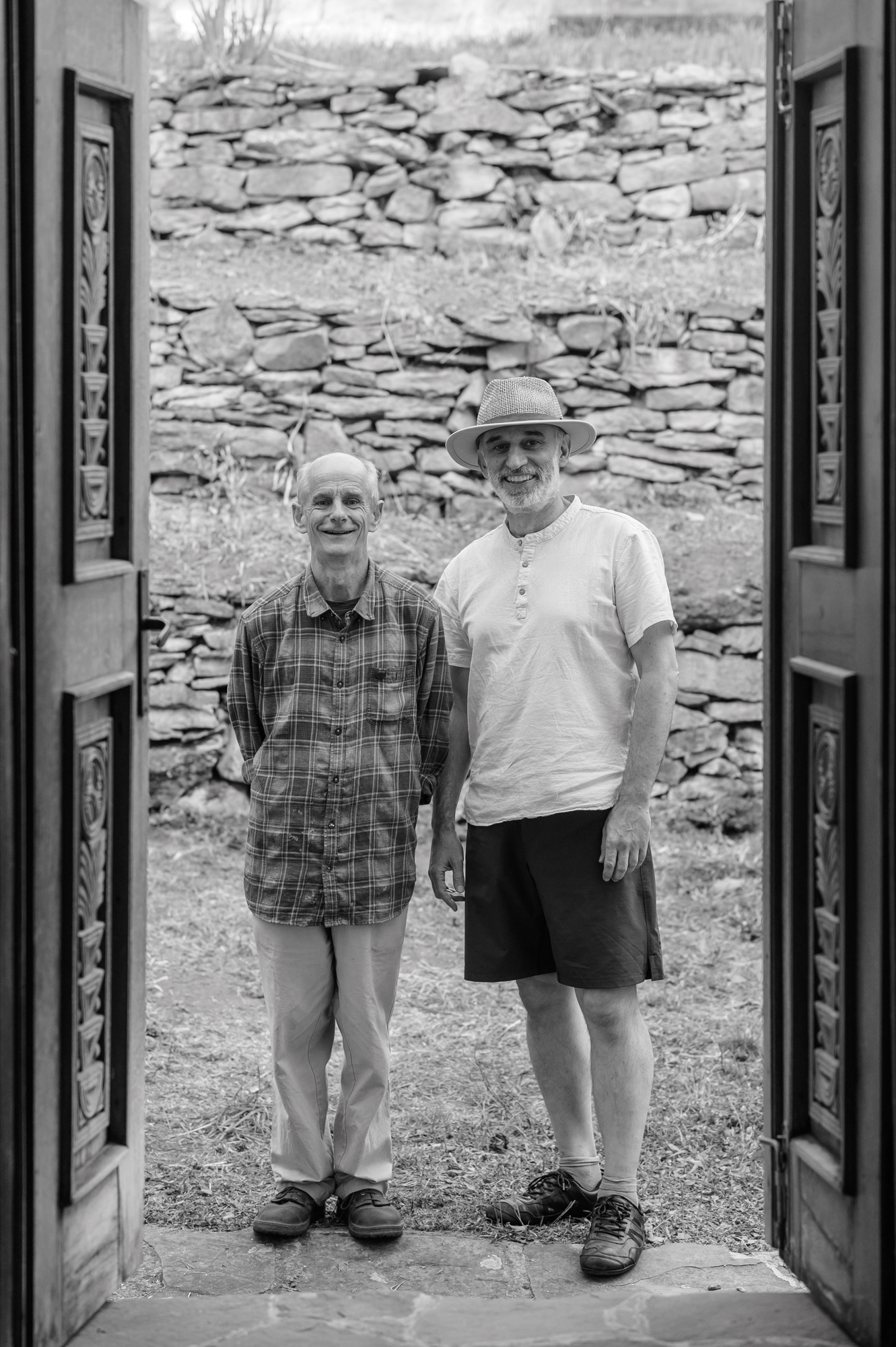
John Neilson and Boril Karaivanov, the Old School in Bozhentsi.
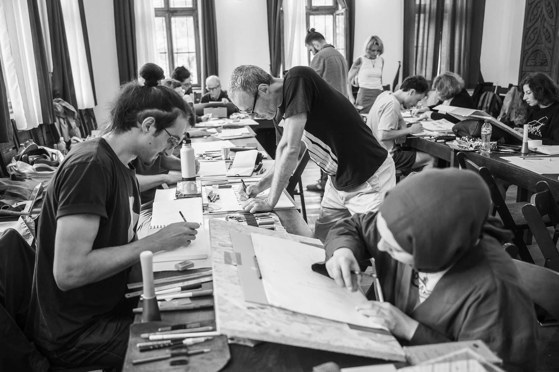
The event took place in the context of Typocamp 2026: Stone Carving Lettering — an international masterclass held from 21 to 25 July in Bozhentsi, dedicated to letter carving in stone and led by John Neilson, a British master of hand-carved lettering in stone who lives and works in Wales.
Images from Typocamp 2026: Stone Carving Lettering (21–25 July) in Bozhentsi — a masterclass with 15 participants from Bulgaria, Italy, Argentina and Turkey, dedicated to hand-carved lettering in stone.
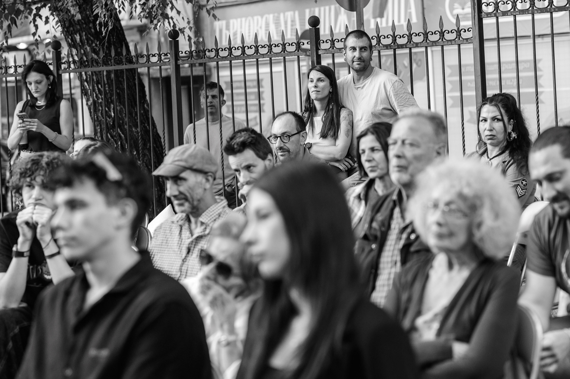
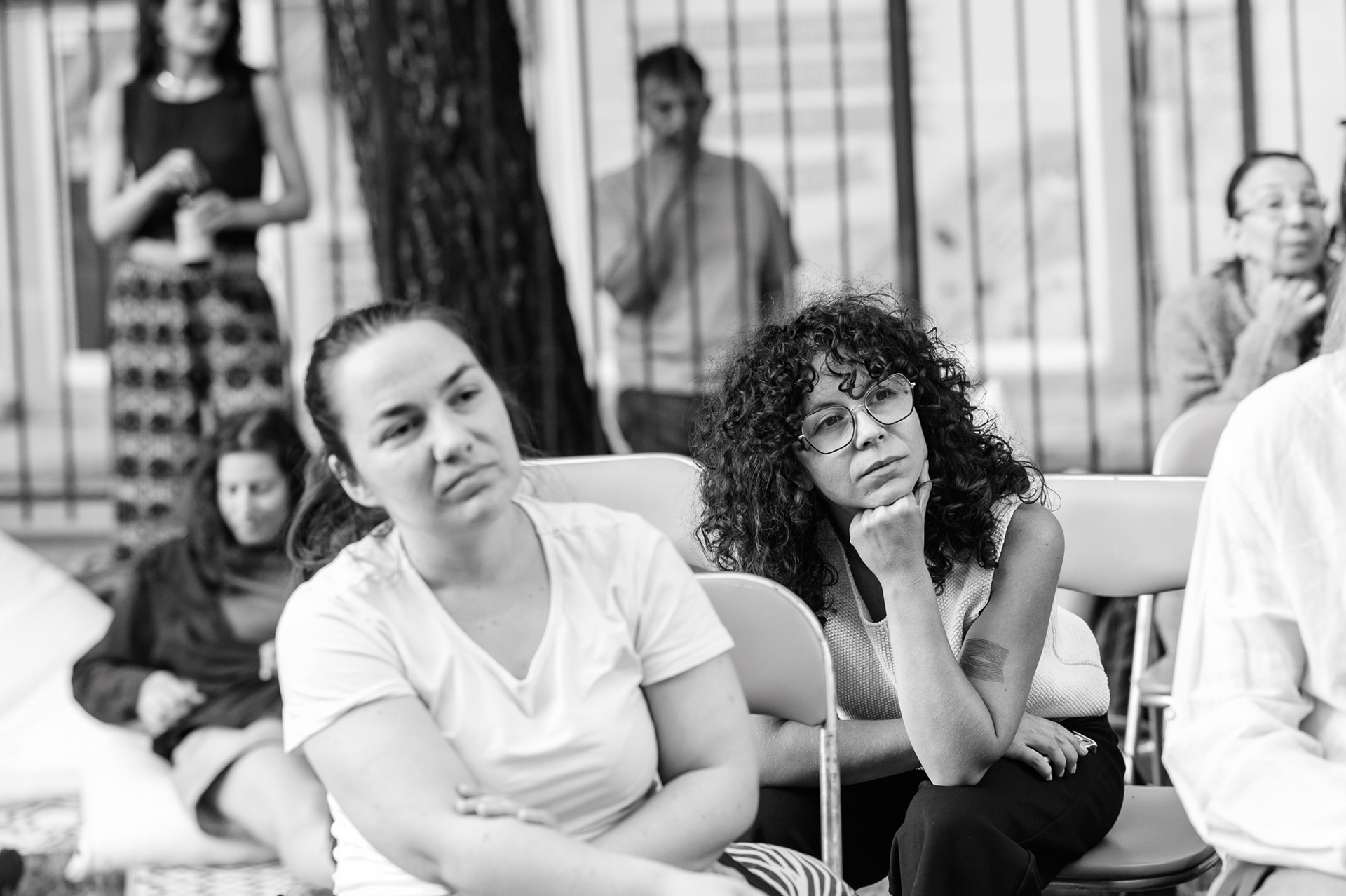
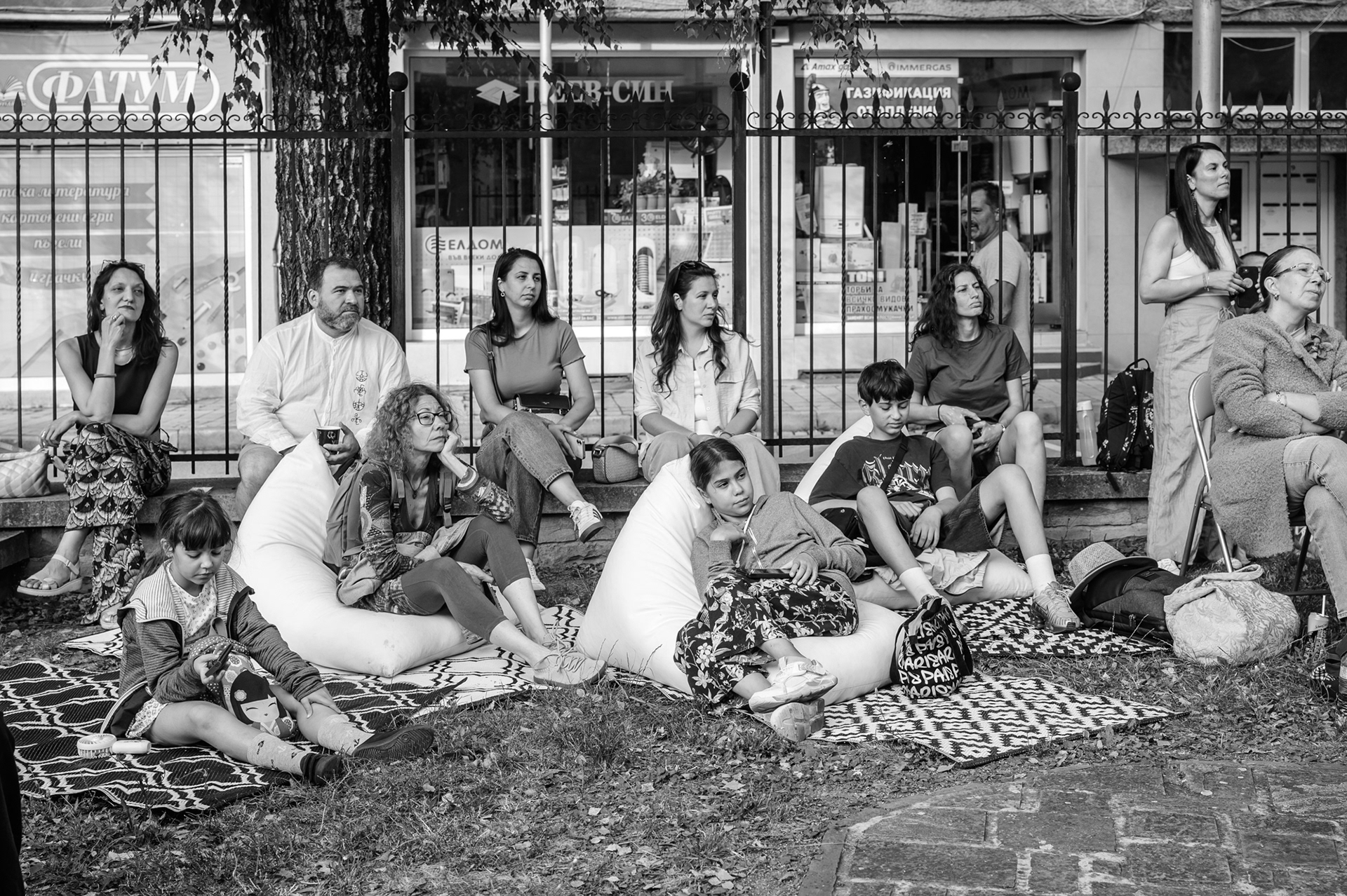
The evening brought together a wide audience for such a specialised topic: architects, designers, artists, cultural researchers, lecturers from the art scene in Veliko Tarnovo, Typocamp participants, guests from the city and the region, people who had come especially for the conversation, children, as well as passers-by who stopped by the courtyard. And perhaps the most valuable presence was that of two stone carvers from Gabrovo who also work with letters in stone.
Letters as a Cultural Choice 
The first part of the meeting was led by Boril Karaivanov — founder of Typo.bg, organiser of Typocamp and one of the people who have worked for years to support the understanding and promotion of the Bulgarian form of Cyrillic through the initiative “Manifesto for the Bulgarian Cyrillic Script”.

Boril Karaivanov — founder of Typo.bg, organiser of Typocamp and initiator of the “Manifesto for the Bulgarian Cyrillic Script.”
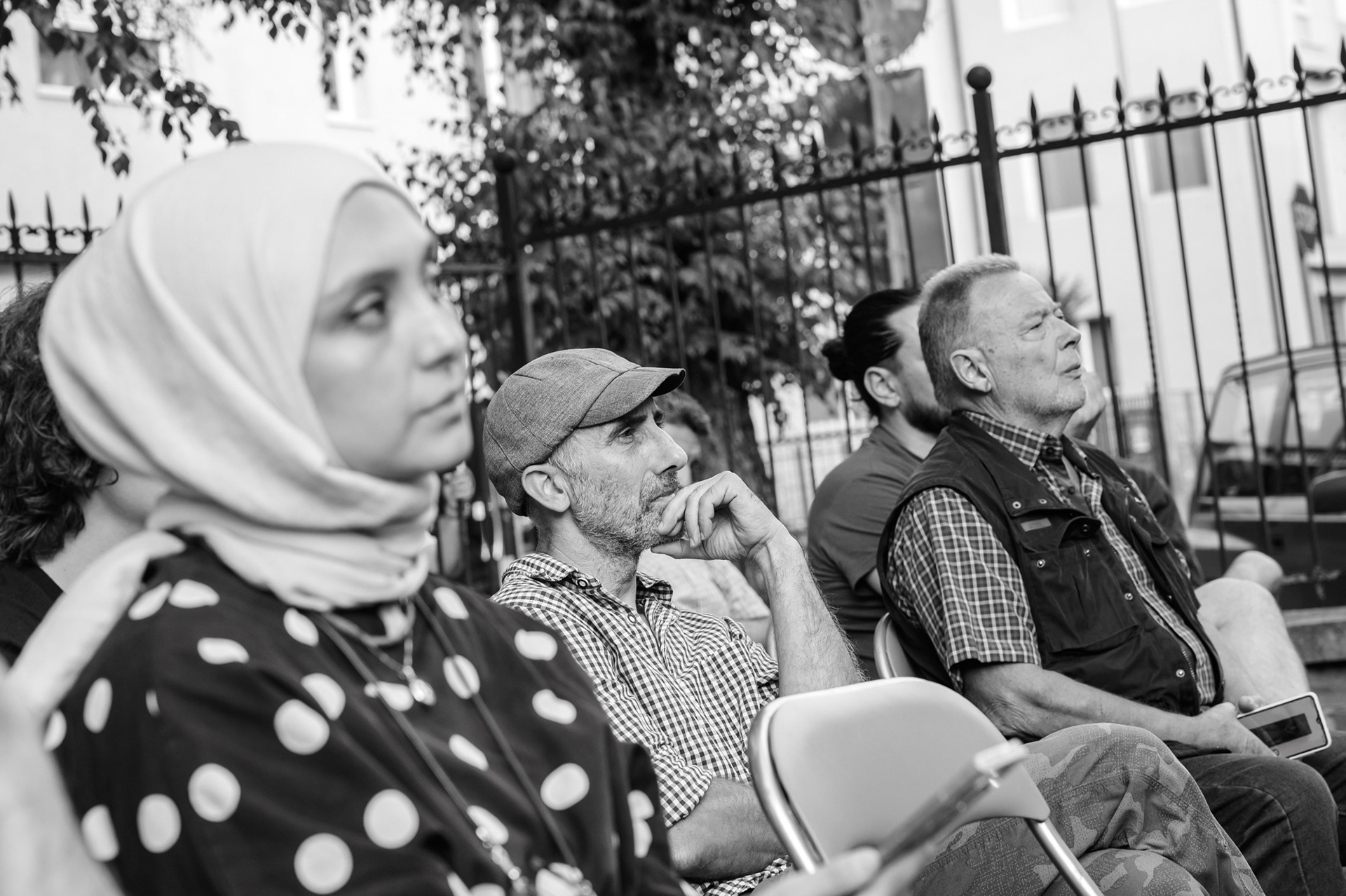
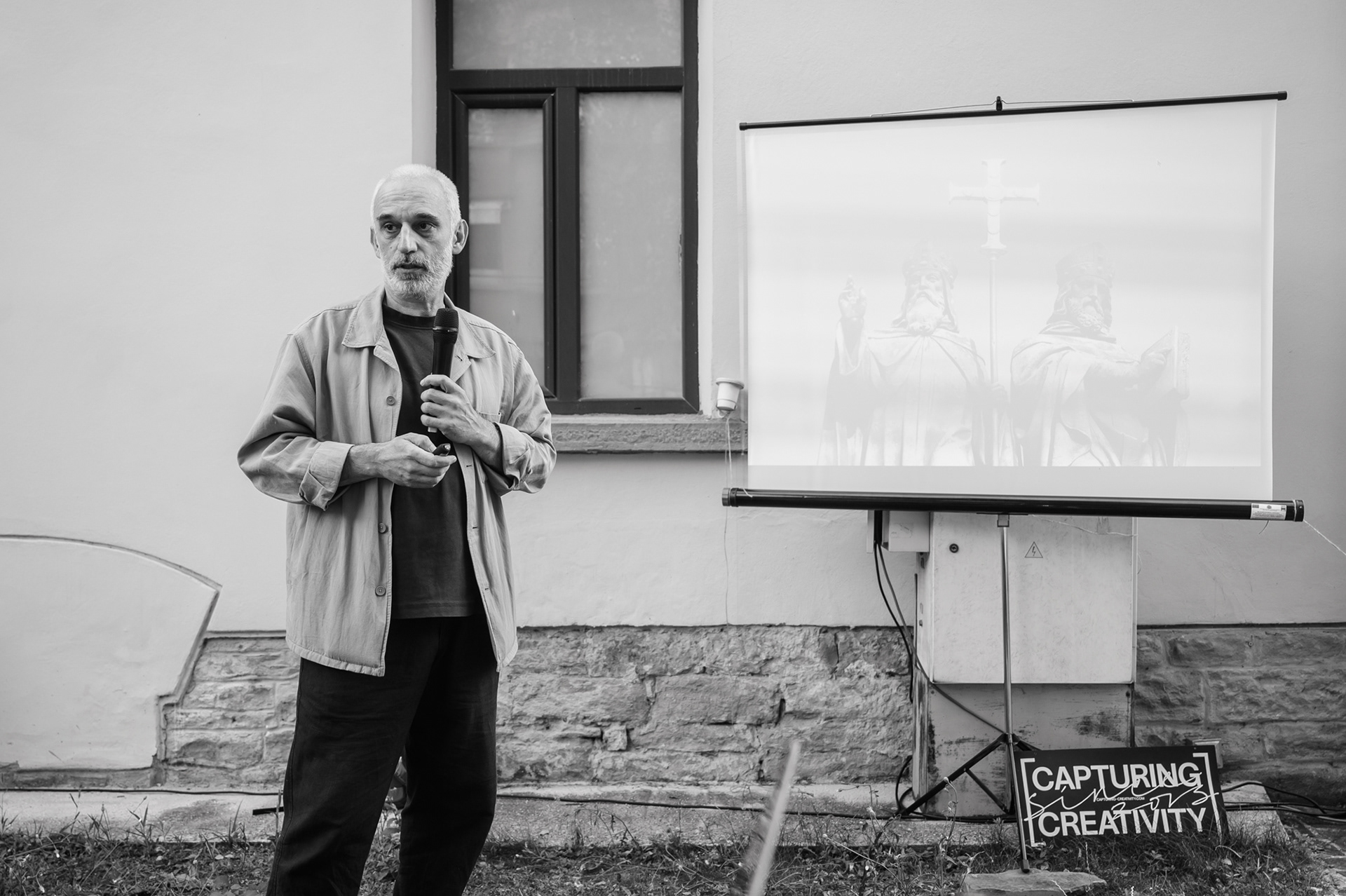
He placed the topic within a broad historical context: from the relationship between Glagolitic, Cyrillic and Greek graphic models, through manuscript and print traditions, to the civil script and the contemporary digital environment.
One of the most interesting points was the difference between the development of Latin and Cyrillic lowercase letters. In the Latin script, the forms gradually developed through writing, the movement of the hand and the search for a more efficient gesture. In Cyrillic, this process was interrupted and fixed by historical, technological and political decisions.
This is where the meaning of the Bulgarian form of Cyrillic emerges as a professional and cultural question: it brings attention back to letters as part of our visual identity — forms in which history, hand, language and memory accumulate.

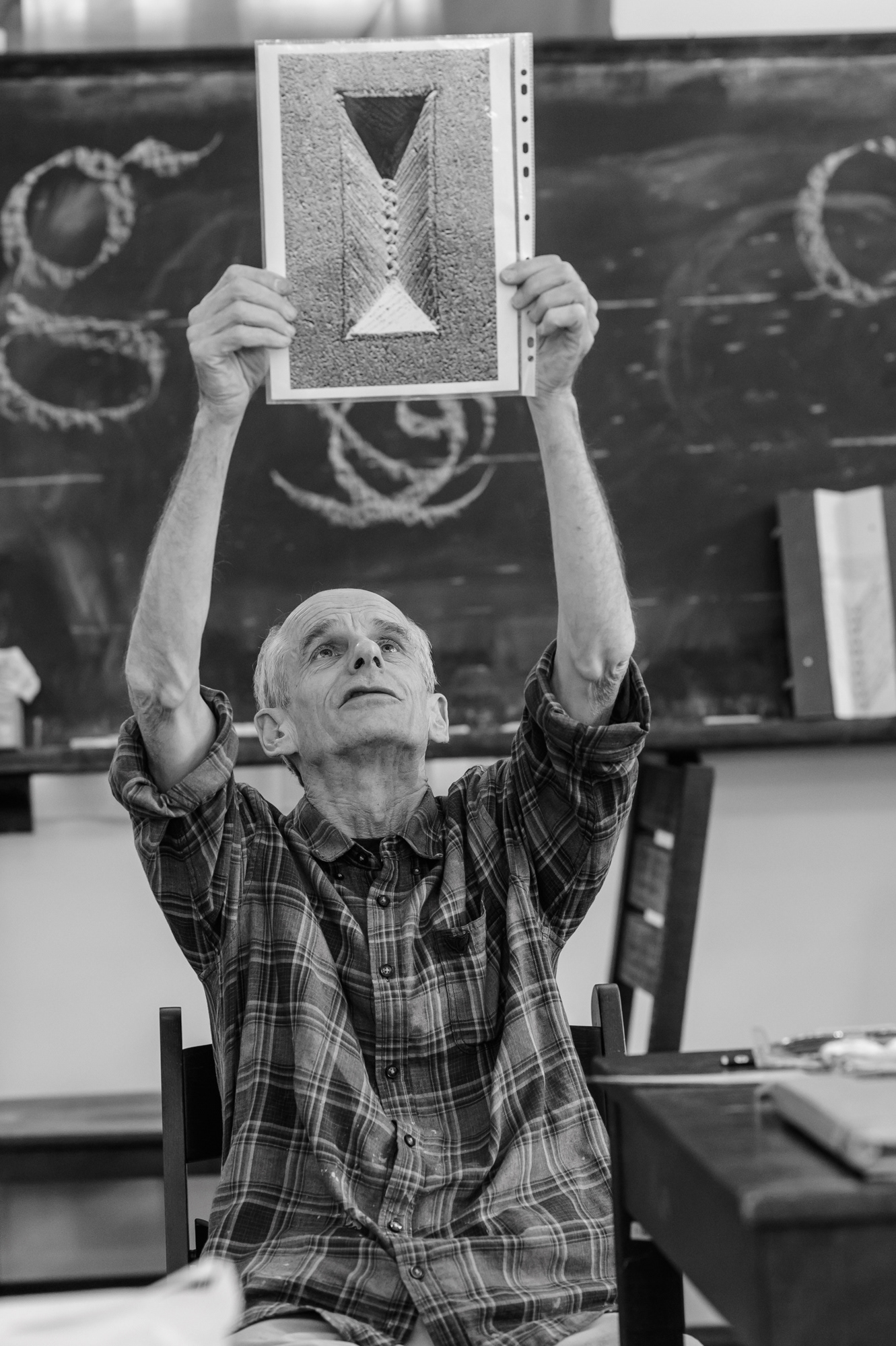
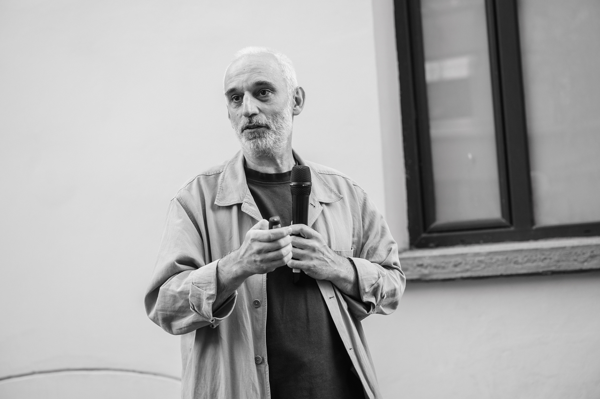
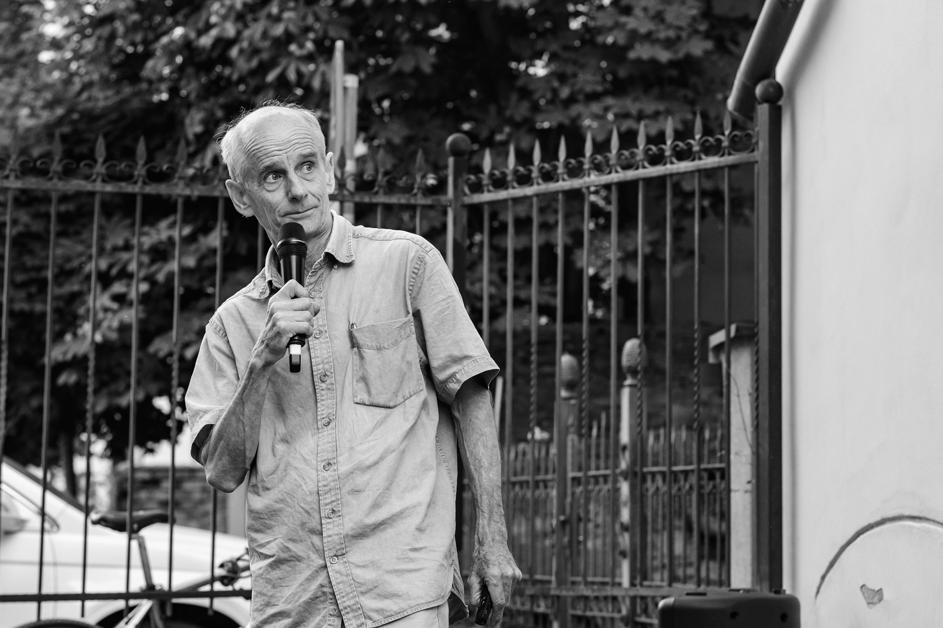
John Neilson presents his practice as a British master of hand-carved lettering in stone.

The Letter as Hand, Stone, Light and Shadow
The second part of the meeting opened the topic towards stone.
The conversation with John Neilson was interpreted live by Kalina Zhecheva, which made this highly specialised topic accessible to the audience in the courtyard.
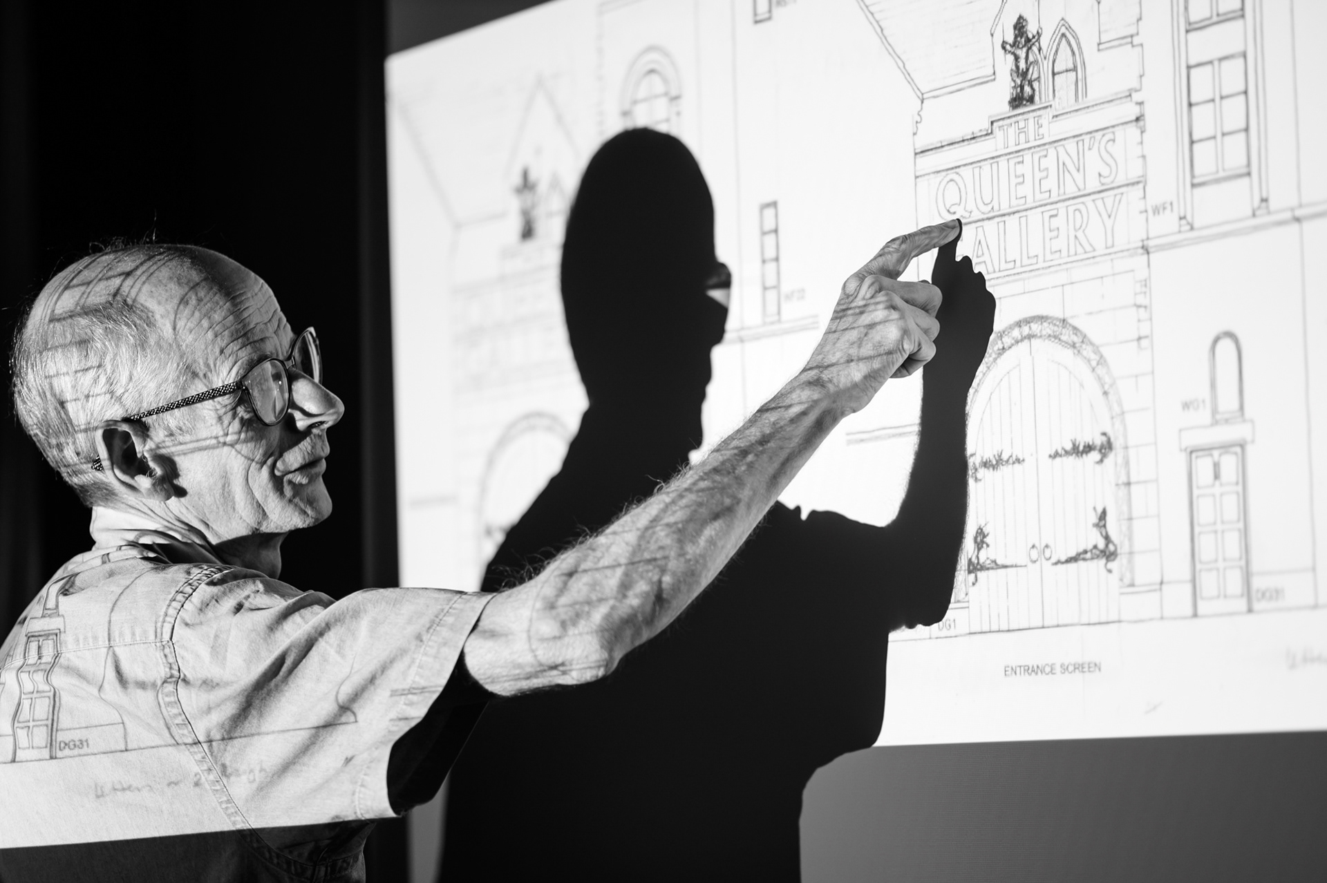
John Neilson presented his practice as a master of hand-carved lettering in stone — a profession in which design, material and gesture are inseparable. He showed examples of his work with gravestones, memorial inscriptions, architectural elements and public art projects. Among them was his work for the Queen’s Gallery in Edinburgh, now The King’s Gallery — an example of the place of the stone letter in a prestigious public and architectural context.
Arch. Radomir Dankov asks John Neilson a question during the meeting
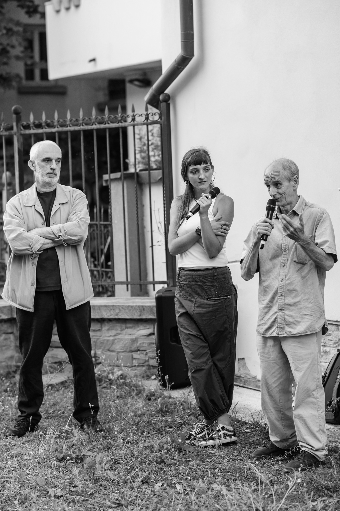
Iva Savcheva was among the audience — an artist, sculptor and stone carver who also works with stone
One of the important points in his presentation was the difference between machine-made and hand-carved letters. A machine can execute an inscription, but in hand carving, each work begins as an individual design — according to the text, the stone, the scale, the distance, the light and the place where the letters will remain.
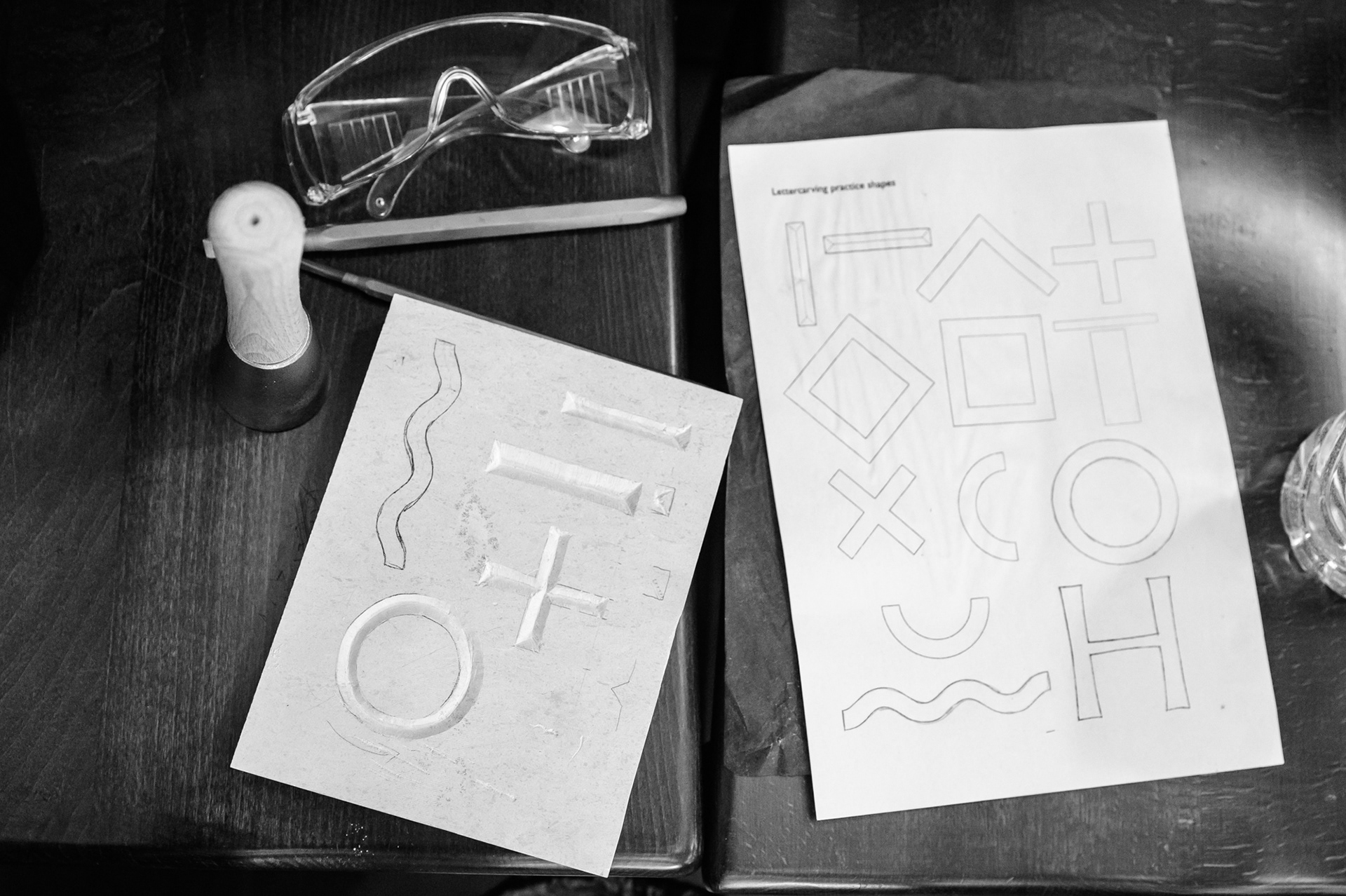
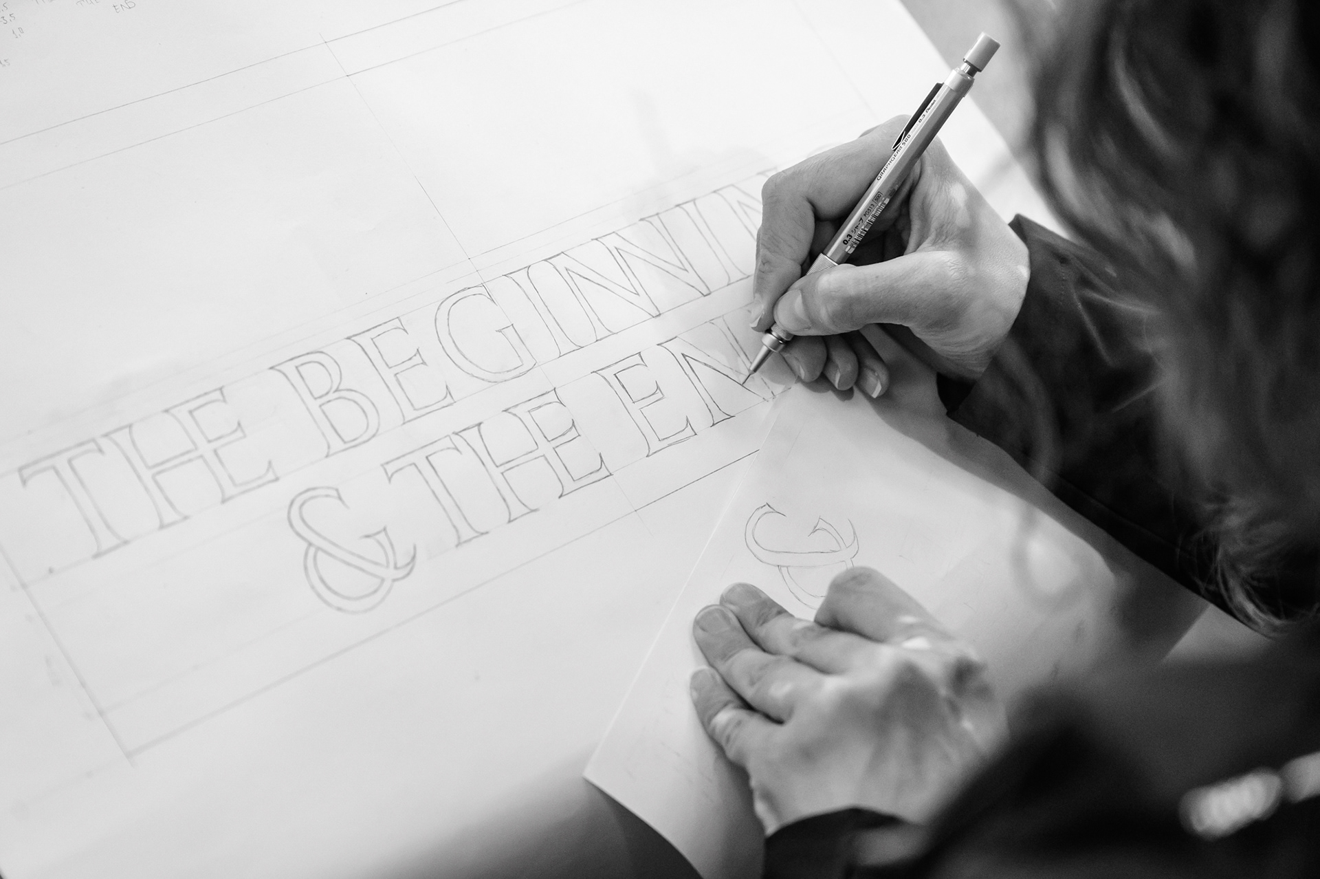
The process does not begin with the chisel. It begins much earlier — with conversation, pencil, paper, composition, spacing between letters, hierarchy of information and careful attention to detail. In stone, there is no easy correction. A mistake in a date, a letter or a line can mean starting all over again. This is precisely why the craft requires such close attention to every movement.

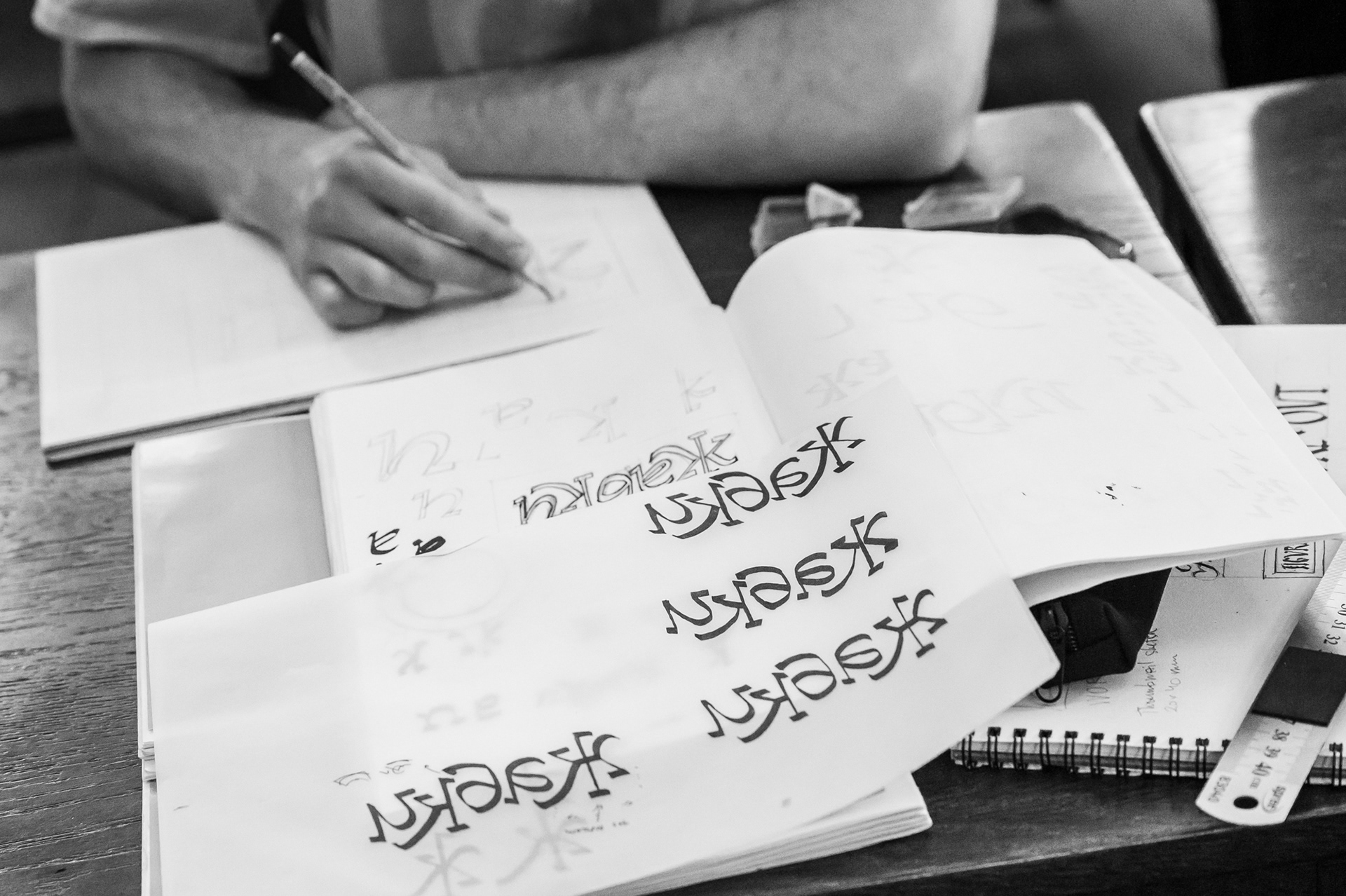
Preparation for work in stone during the masterclass in Bozhentsi — searching for form, composition and spacing between the letters on paper.

Particularly memorable was the topic of light and shadow. In a stone letter, the form is not read only as a contour. It appears through the edge, the depth of the cut, the direction of the light and the shadow cast by the material. An inscription may be precisely made, but if it is placed in unsuitable light, it can remain almost invisible.
Stone also participates in the design. John spoke about slate, limestone, sandstone and granite — about how each material changes the rhythm of the hand and the character of the letter. Slate gives a more graphic, typographic result; limestone and sandstone allow for a more sculptural feeling; granite requires an entirely different way of working with the tool.

Text in stone: “Ça casse, ça passe” — “It breaks, it passes” — by master letter carver John Neilson. Photograph provided by the artist’s personal archive.

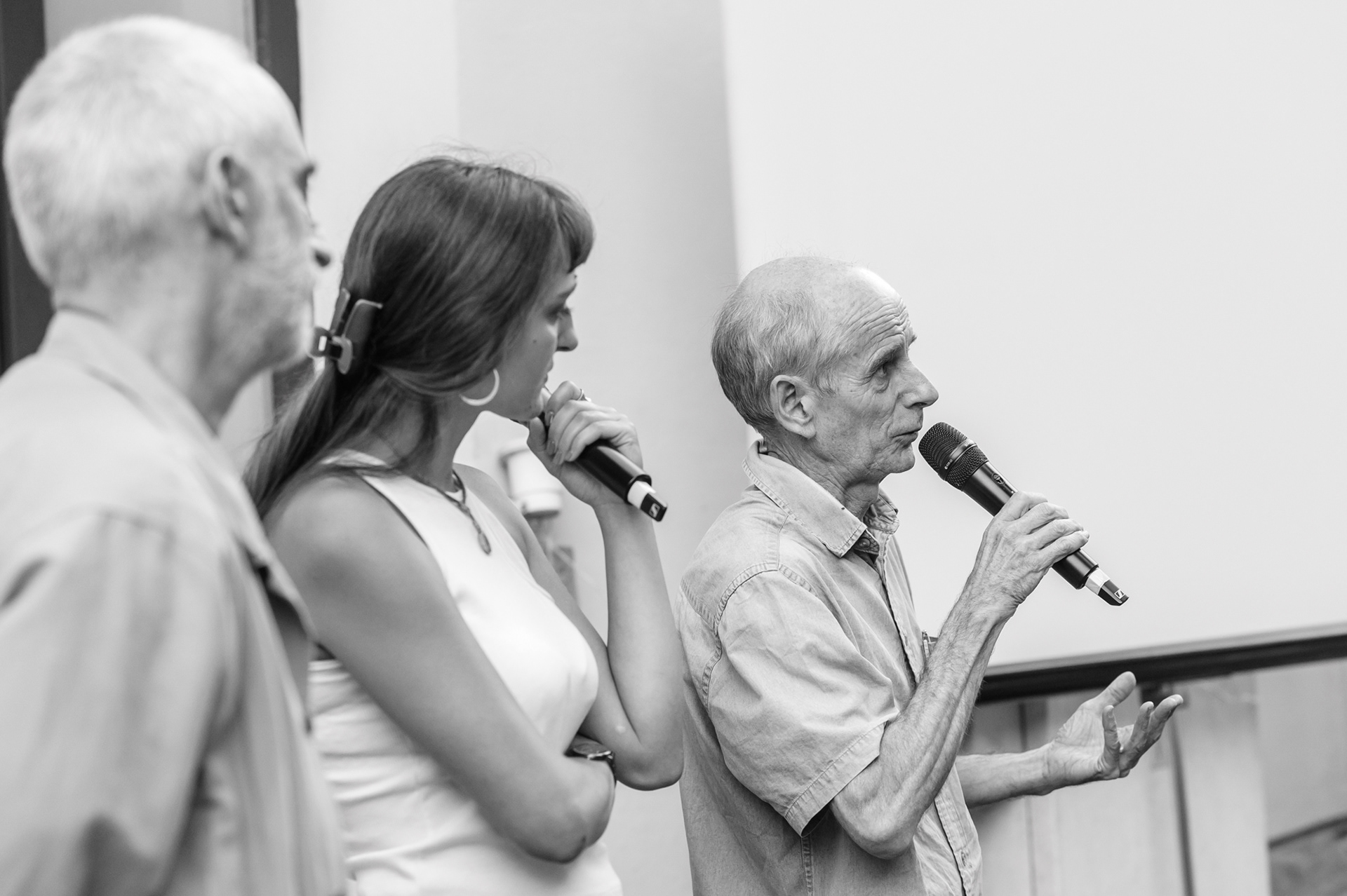
Boril Karaivanov, John Neilson and Rosina Pencheva during the discussion. Photography: Interactive Museum of Industry.
From Gabrovo to Bozhentsi

The most valuable continuation of the meeting took place in the days that followed, while the masterclass continued in Bozhentsi.
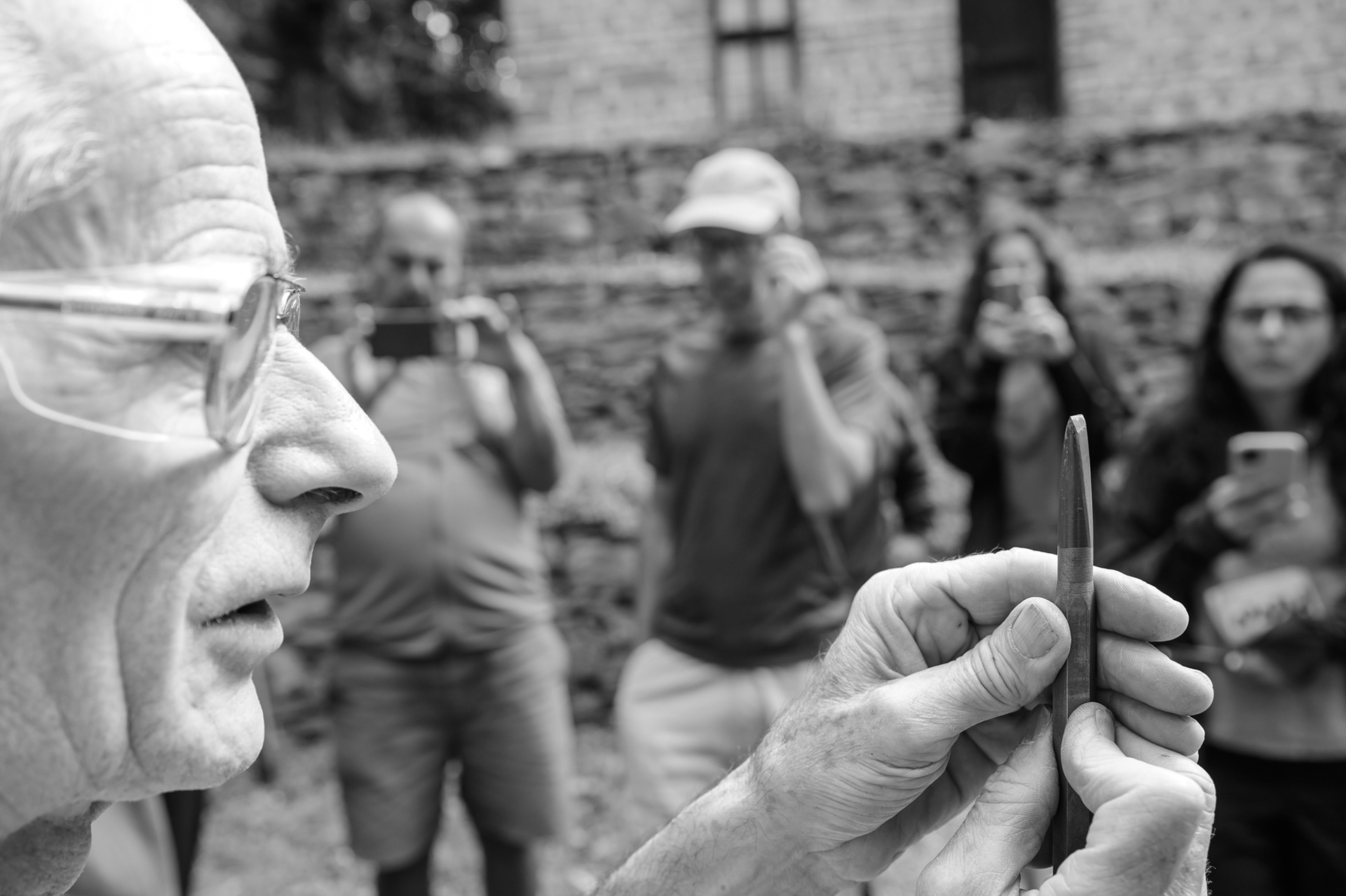
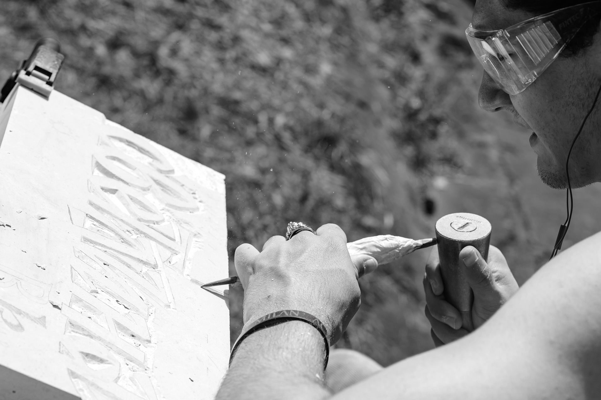
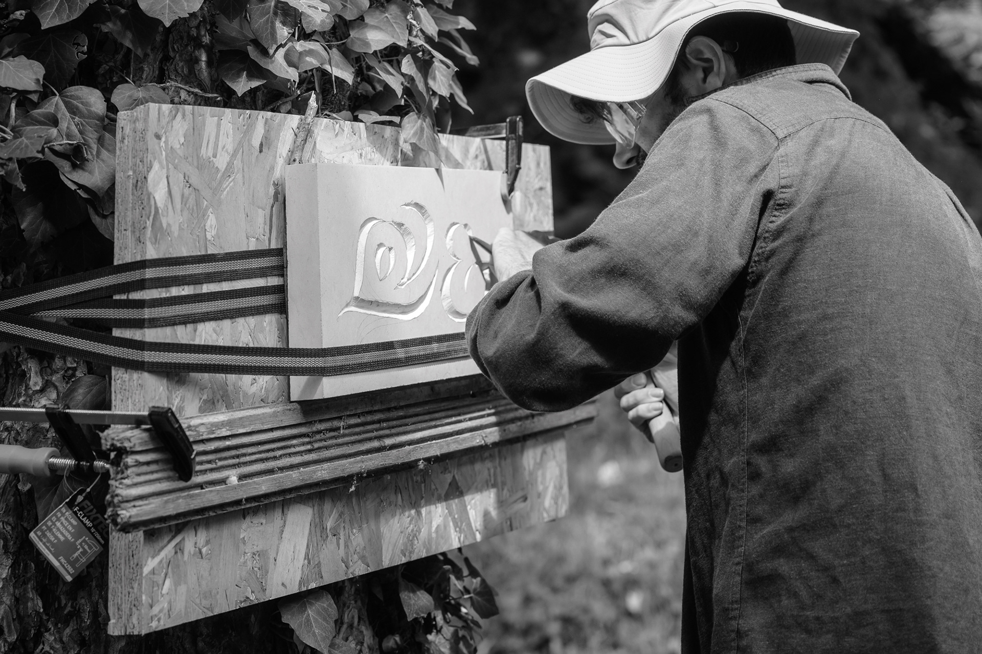
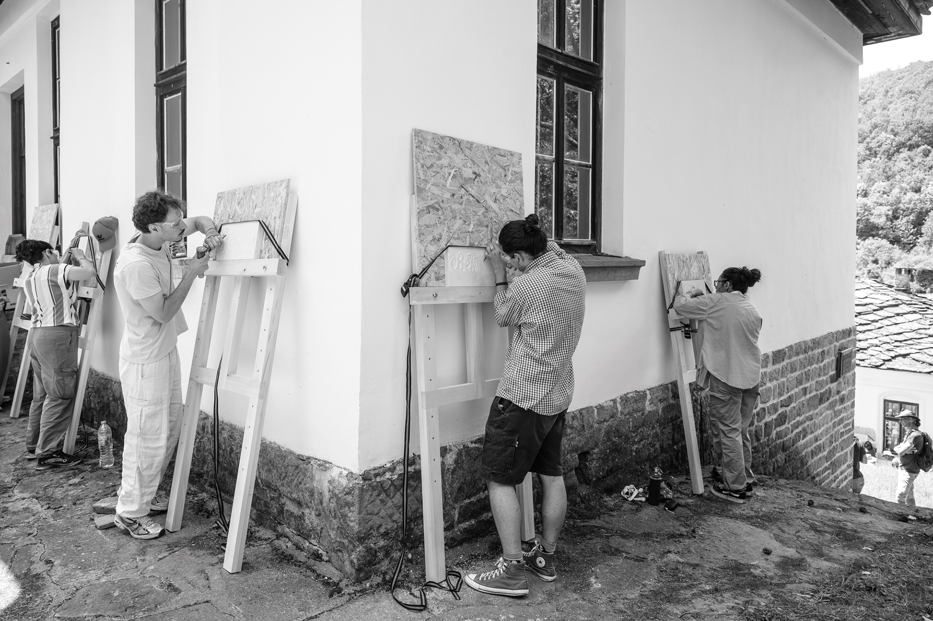
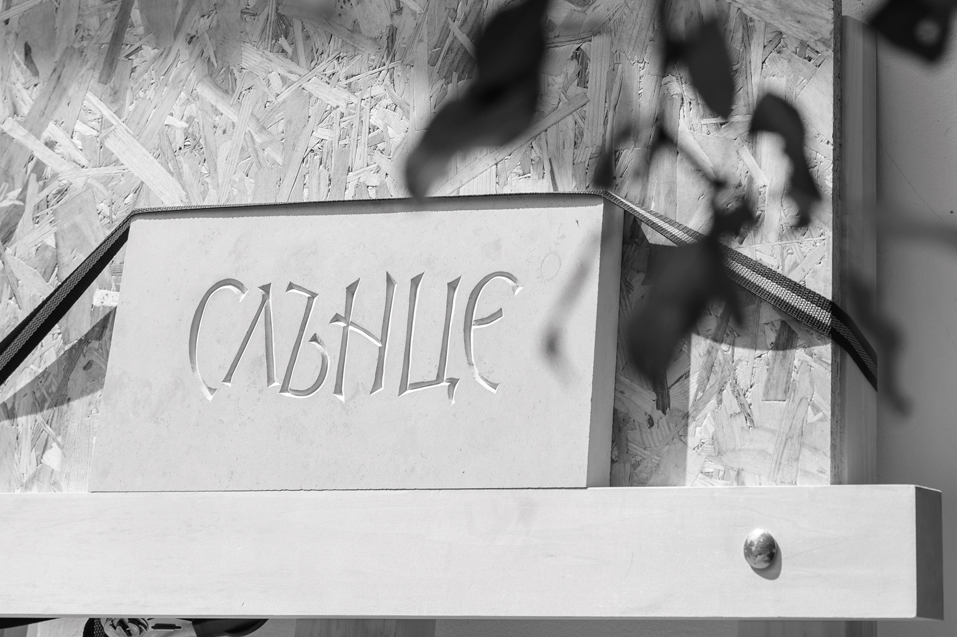
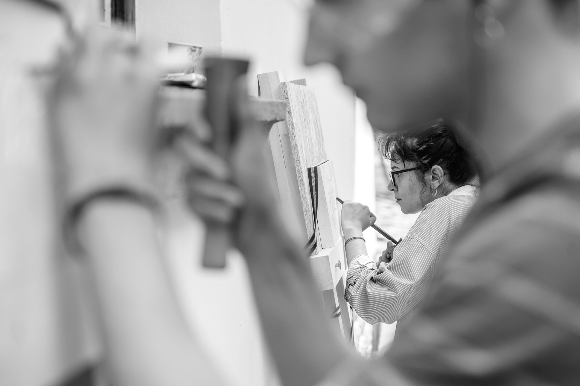
At the end of the public conversation, guests were invited to visit the masterclass at the Old School in the village of Bozhentsi and to see the process up close. Some of them did come. There they saw the preparation before the carving itself: work on paper, the search for form and spacing, preparation of the tools, sharpening of blades, first strikes, mistakes, corrections, repetition. Each participant had chosen a word or a short phrase and developed it as their own composition for stone — with an individual design of the letters, rhythm and placement on the slab.

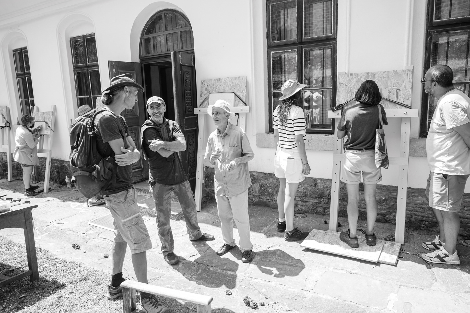
Participants in Typocamp 2026 work outdoors in front of the Old School in Bozhentsi, using special wooden stands for stone carving.
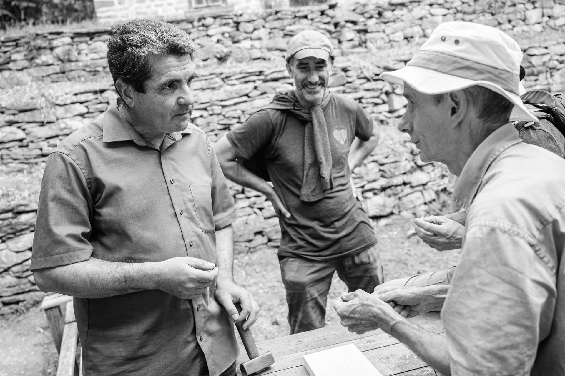
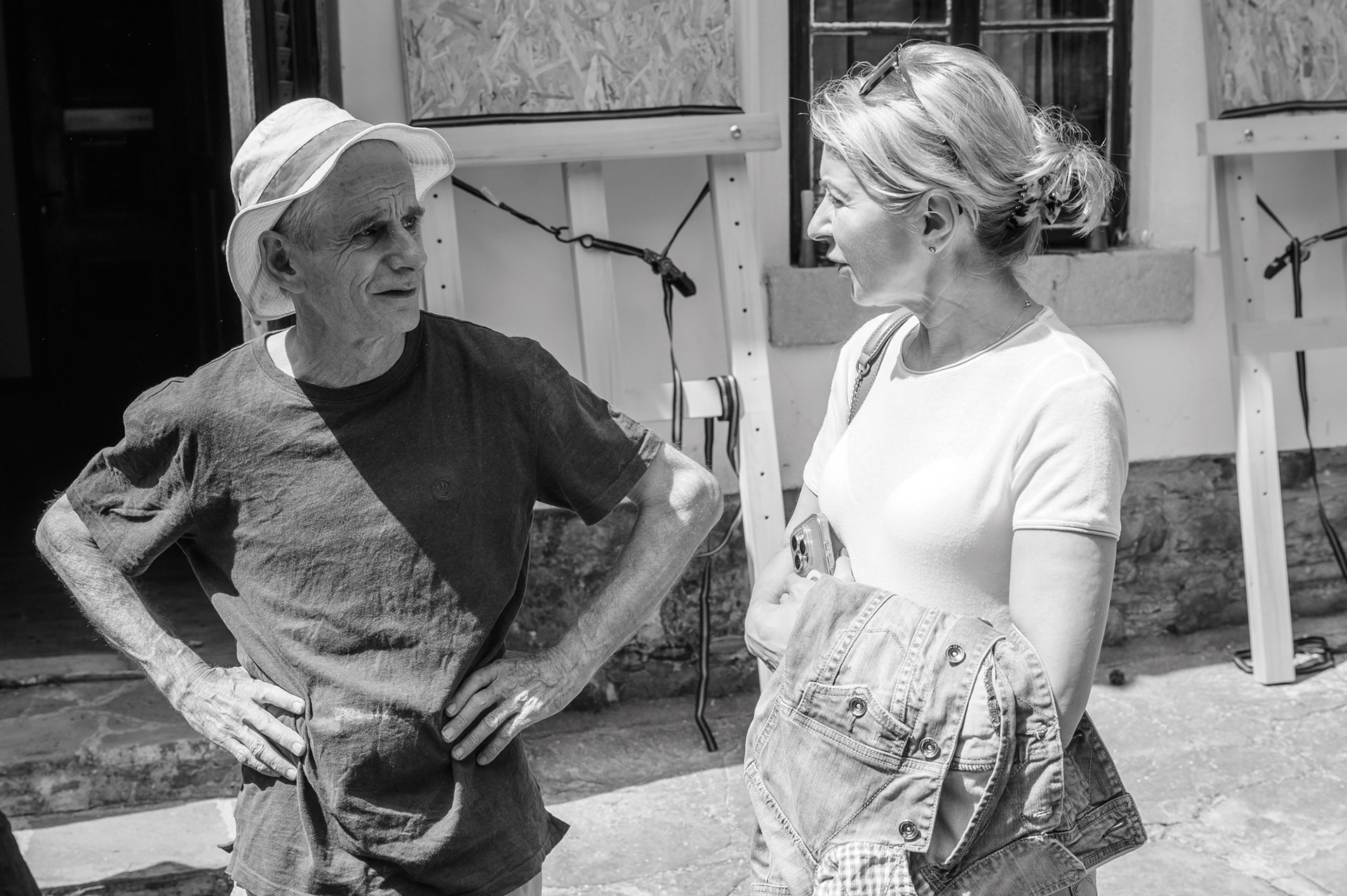
There, one of the strongest moments of the entire visit took place: the encounter between John, the Typocamp participants and local stone carvers from Gabrovo who also carve letters in stone. Among them were Iva Savcheva — an artist and sculptor who has lived and worked in France for years and inherited her connection to stone carving from her father — and Tsvetelin Tsvetkov, a master from Gabrovo who also works with letters in stone. The two showed their techniques and ways of working.
On the left – Tsvetelin Tsvetkov
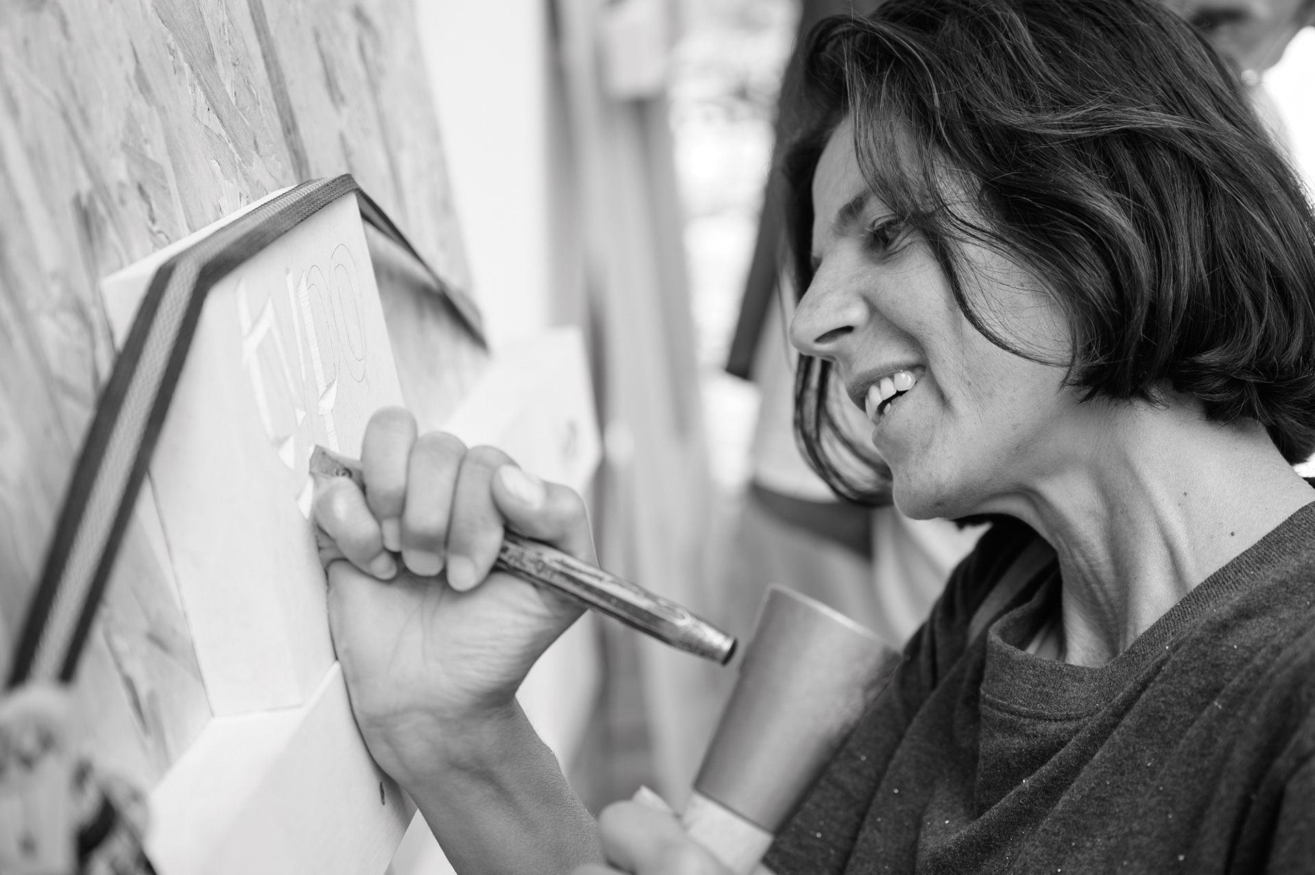
Iva Savcheva demonstrates her approach to working in stone
In the centre — Hristo Totsev
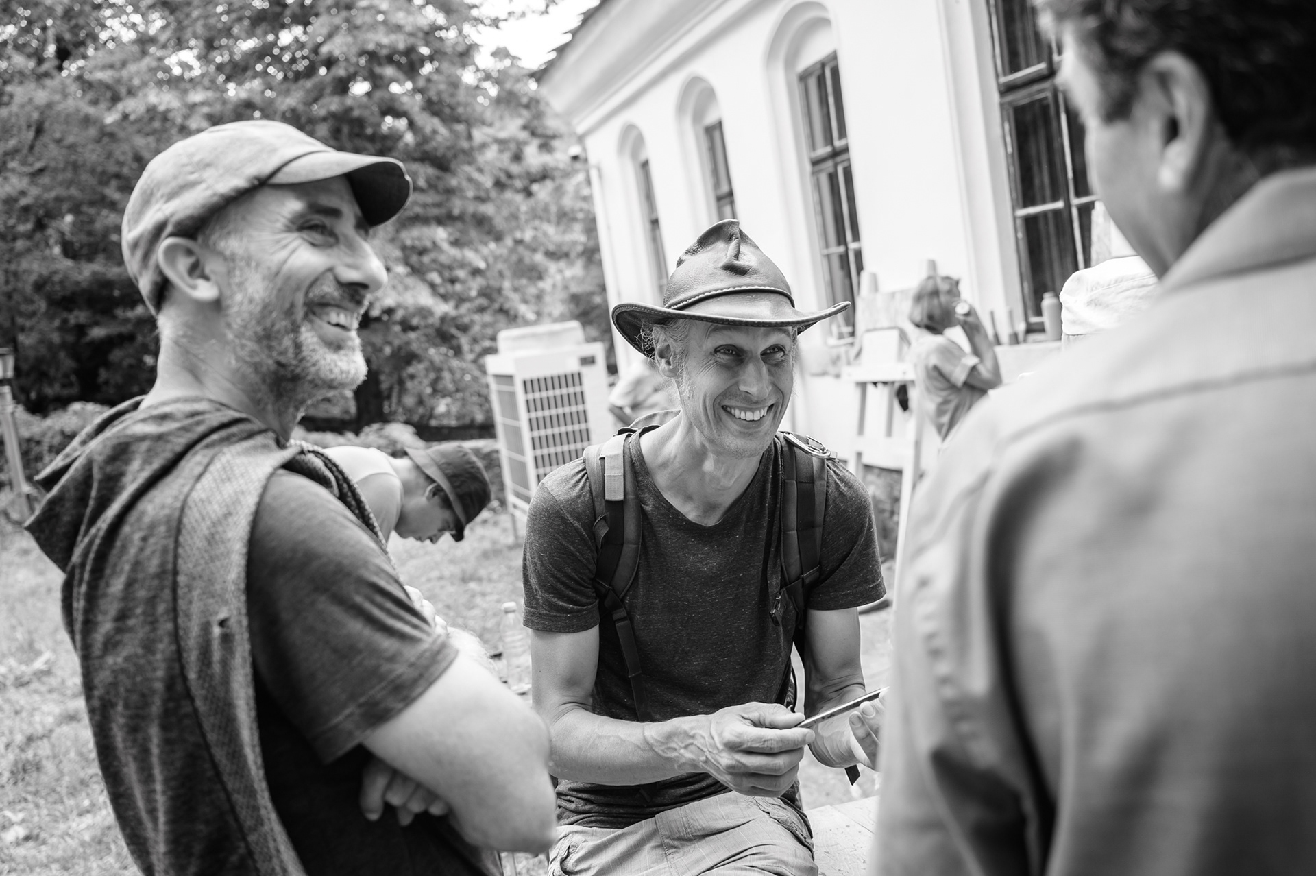
The artist Konstantin Zlatkov and his friend — an architect from the Netherlands living in Gabrovo
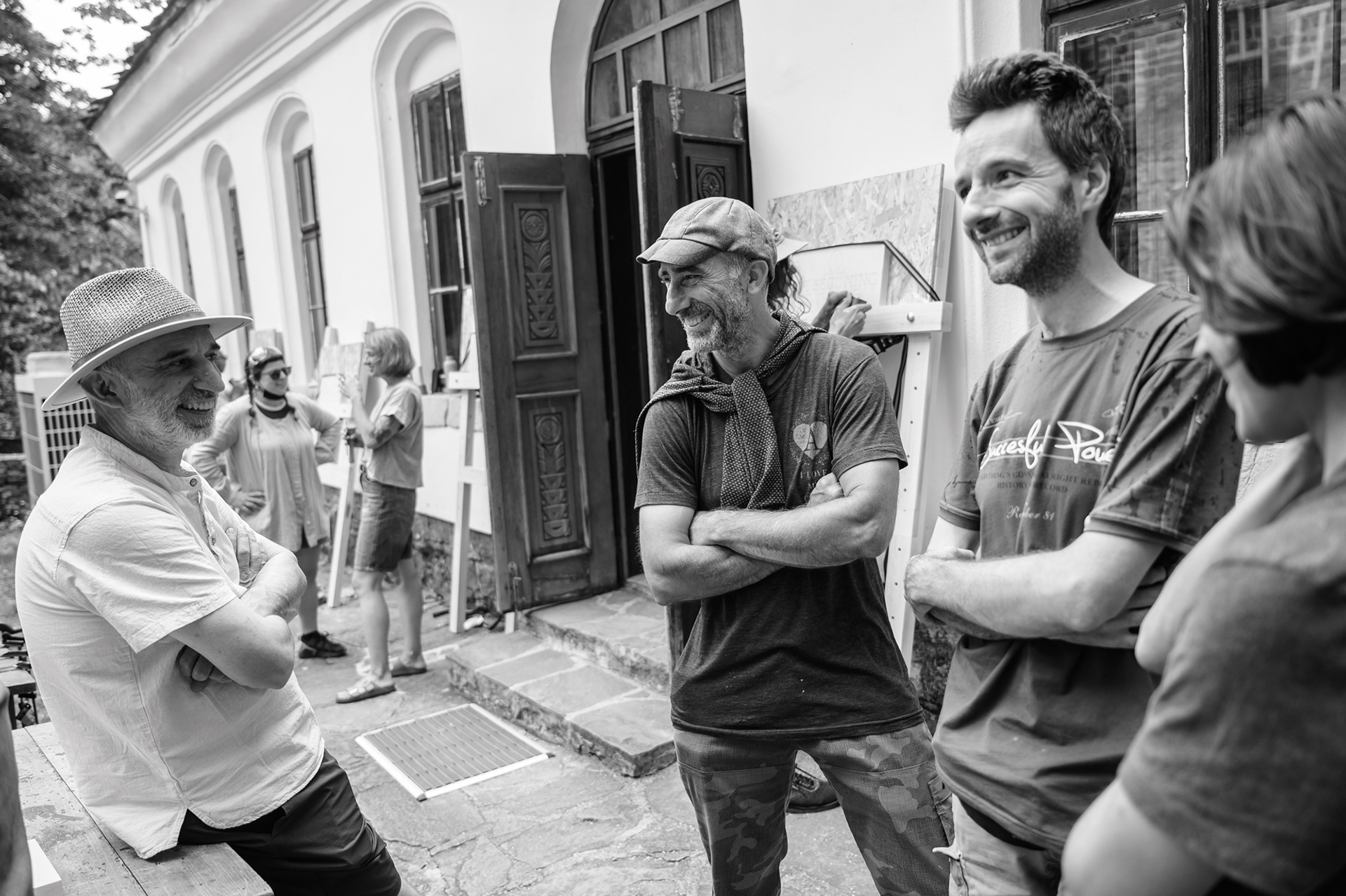
On the right — the artist and painting lecturer Radoil Serafimov

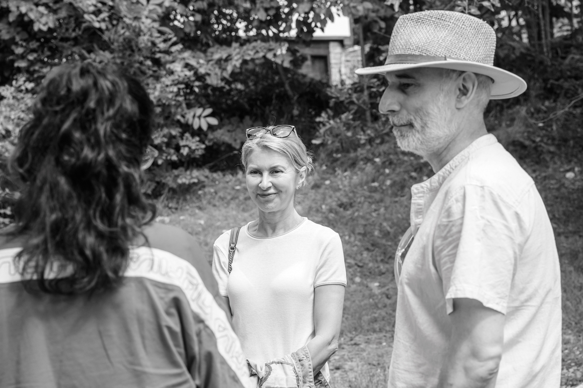
Among the guests in Bozhentsi were Tsvetelin Tsvetkov, Iva Savcheva, Konstantin Zlatkov, Radoil Serafimov, Hristo Totsev and other representatives of Gabrovo’s artistic, architectural and craft communities.
This was an exchange — through hand, tool and material. For John, it was interesting to see a technique close to his own, yet different in angle, grip, movement and tempo. For the participants, it was a rare opportunity to see how one practice can exist across different traditions, even when it is not always named in the same way.
A Meeting with Future Continuation
Among the guests in Bozhentsi were the Mayor of Gabrovo, Tanya Hristova, and Galina Vitanova, head of the municipal department for culture. This visit was important not only as a sign of support, but also as an opportunity to see how such a format could work for the city.

The Mayor of Gabrovo, Tanya Hristova, visited the masterclass in Bozhentsi, while Boril Karaivanov introduced her to the mentor and the participants.
Gabrovo is part of the UNESCO Creative Cities Network as a City of Crafts and Folk Art, and the meeting “Stone, Letter, Place — Typocamp Visits Gabrovo” was also connected to the support for Gabrovo’s candidacy for European Capital of Culture 2032. In this context, the meeting around Typocamp opened a broader conversation: how crafts, design, architecture and visual culture can be more meaningfully present in the urban environment; how letters, signs and façades shape the sense of place; how specialised knowledge can leave the studio and become part of the city’s future.
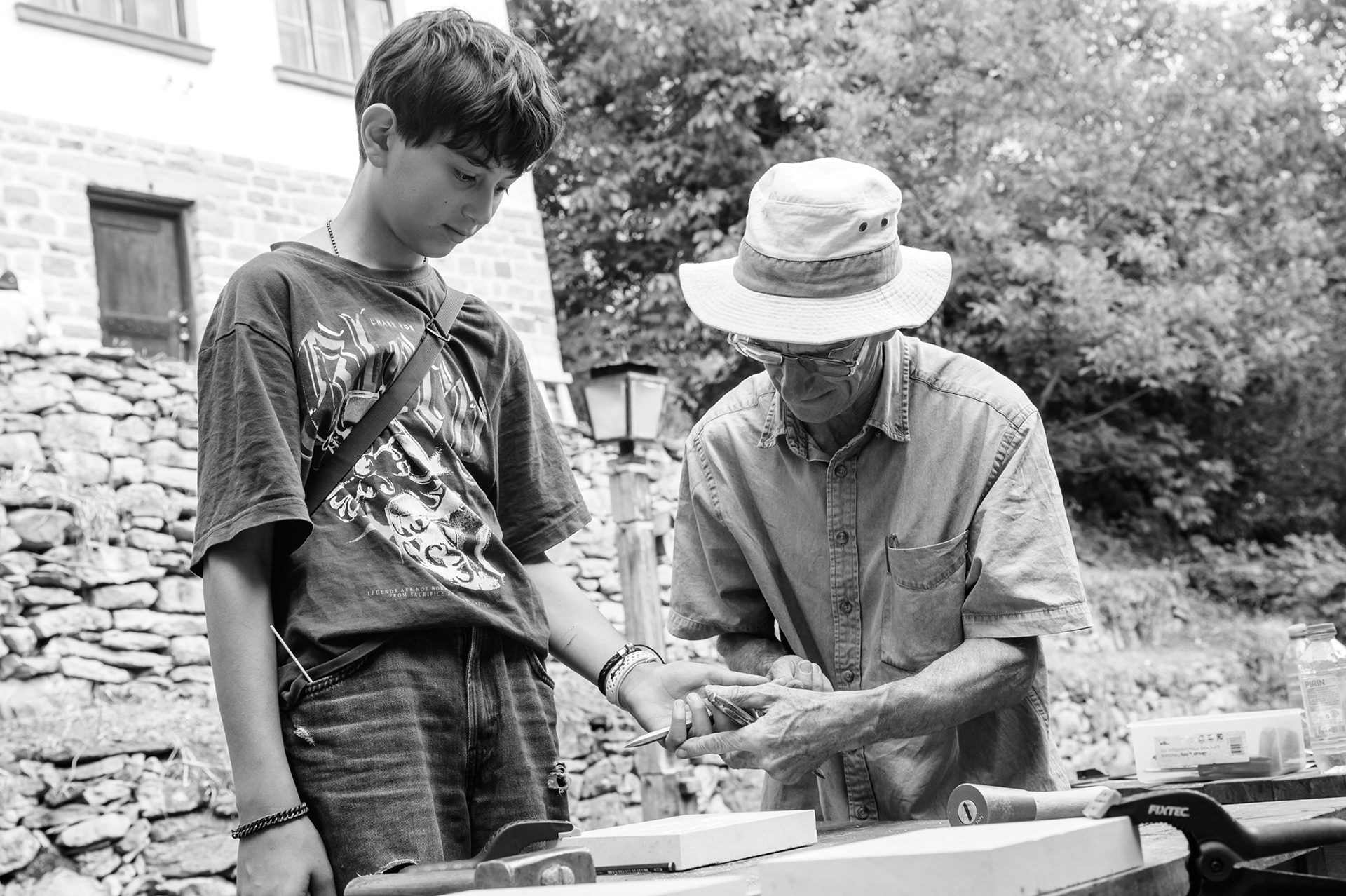
Master dry stone waller Hristo Totsev shows his son Kaloyan how to work with a chisel on stone
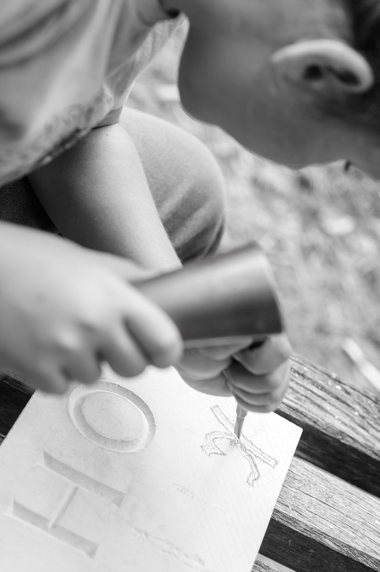
Kaloyan carves his own letter “K”, based on his own design
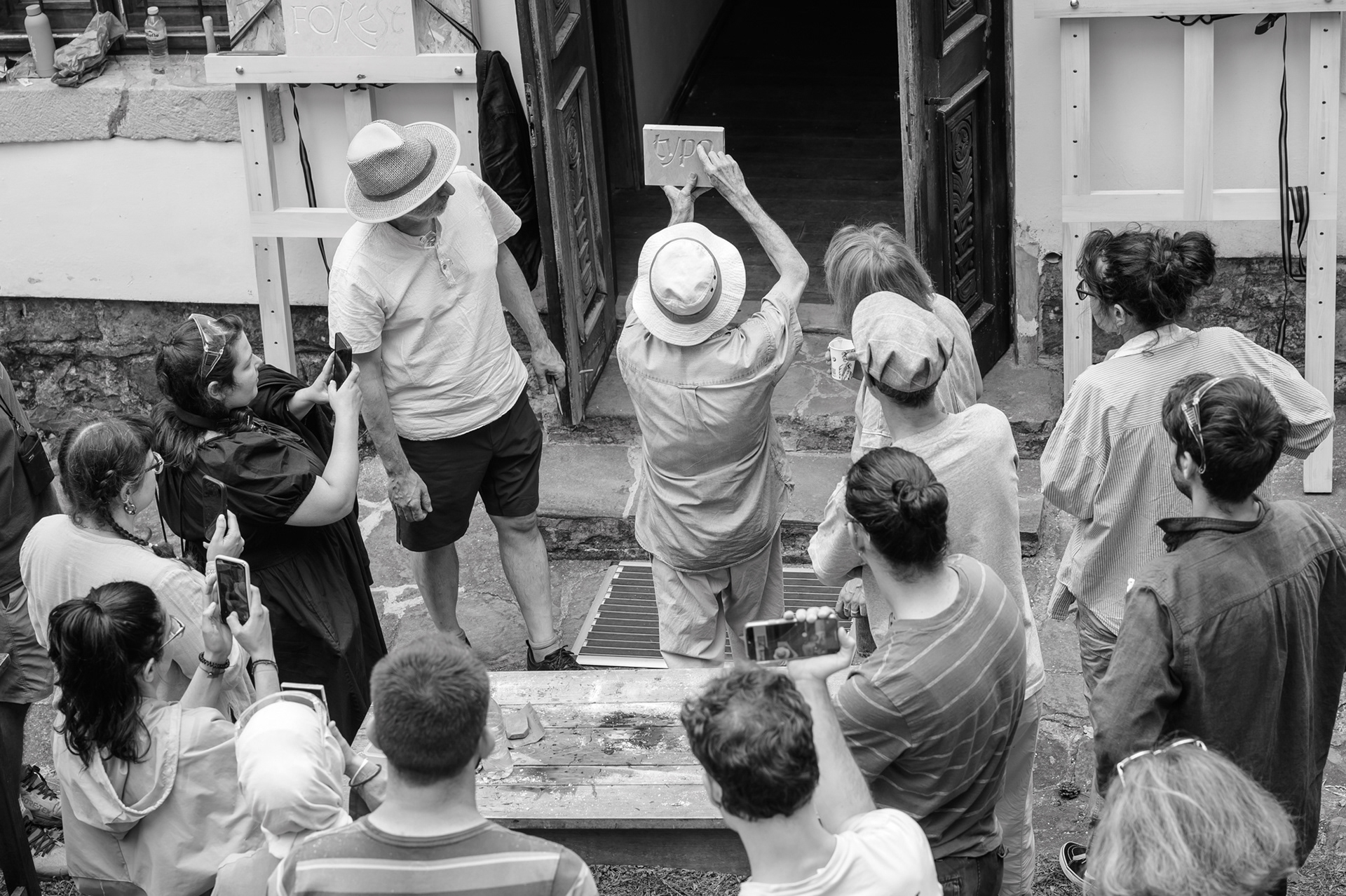
Moments from the training in Bozhentsi — working with tools, demonstrations by John Neilson and encounters between different generations and practices in stone.
At the end of the training, on 25 July, all the stone slabs on which the participants had worked — finished or unfinished — were arranged together. John commented on each of them: where the stone had resisted, where the hand had found rhythm, where the letter had begun to appear more clearly.
During the final critique, the light kept changing — from direct sun to cloudy sky and back again. In this way, quite spontaneously, it became a demonstration of how differently letters can be read depending on the edge, depth, shadow and direction of the light.
Master John Neilson and Gabrovo mayor Tanya Hristova
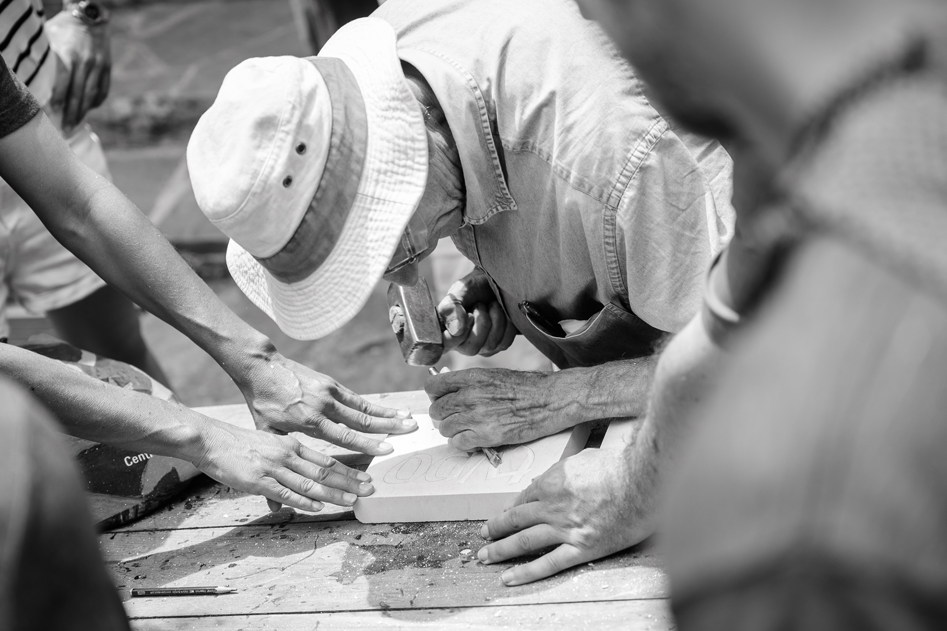
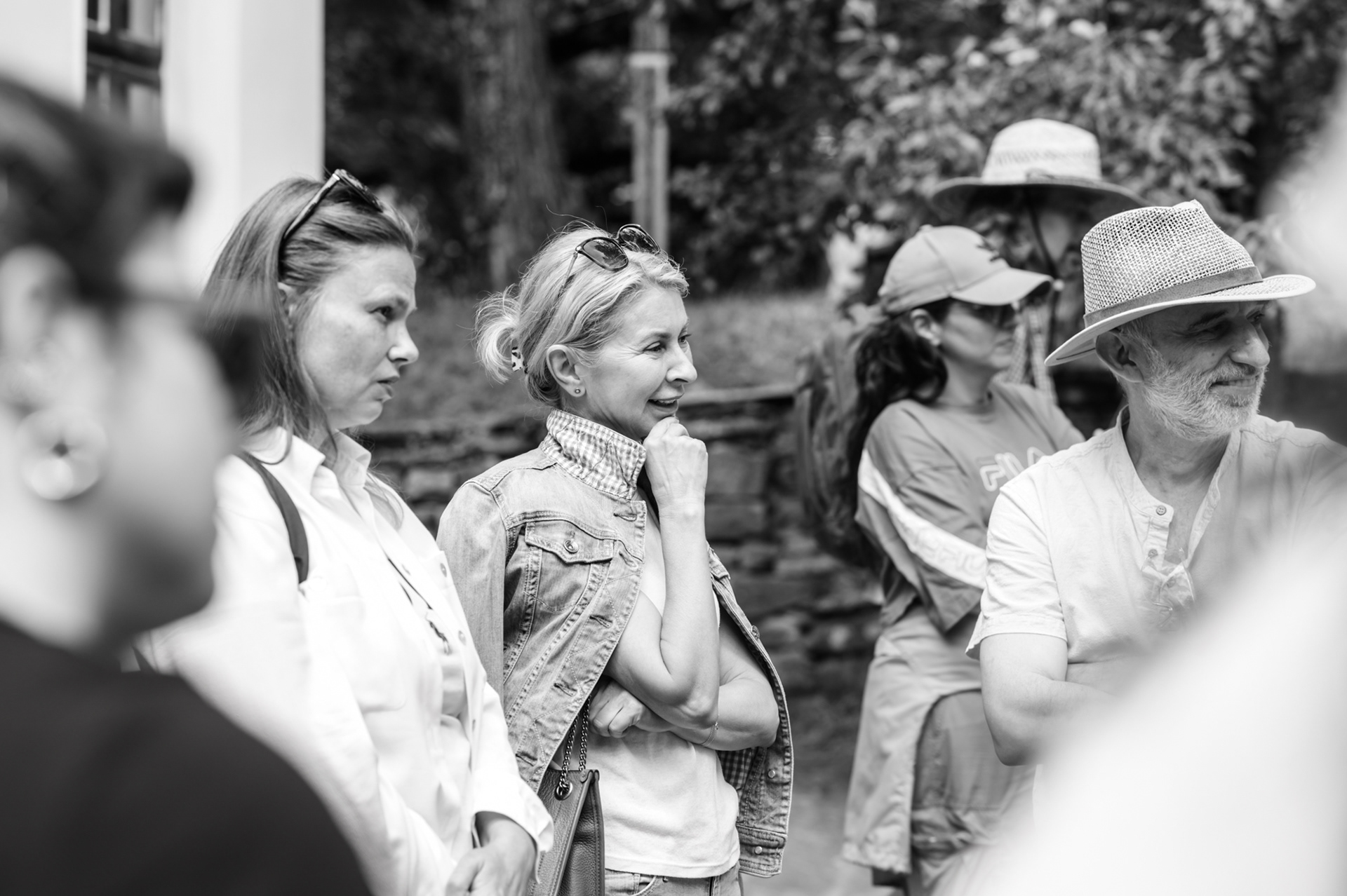
Galina Vitanova, Tanya Hristova and Boril Karaivanov observe John Neilson at work
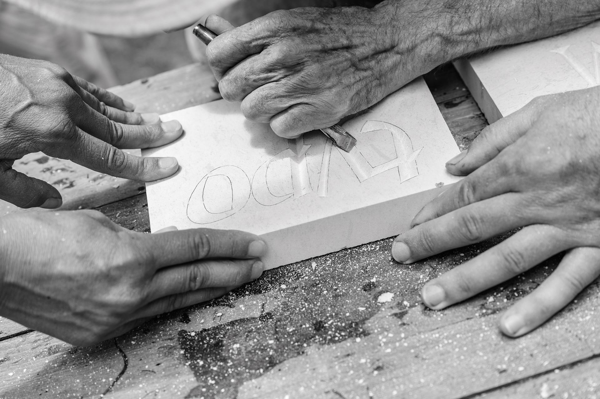
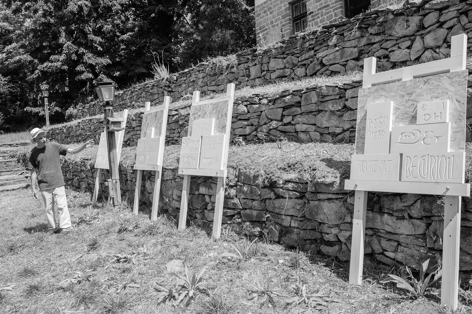
Final review of the works at the end of the training — John Neilson comments on the participants’ stone slabs
Critique — a collective viewing, professional discussion, analysis and assessment of the carved works
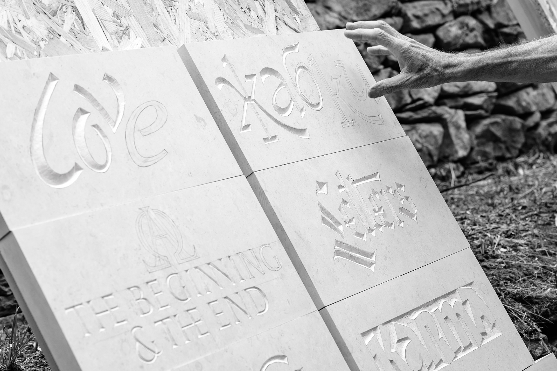
Finished and unfinished stone slabs from Typocamp 2026 — traces of five days of working with letter, tool and material
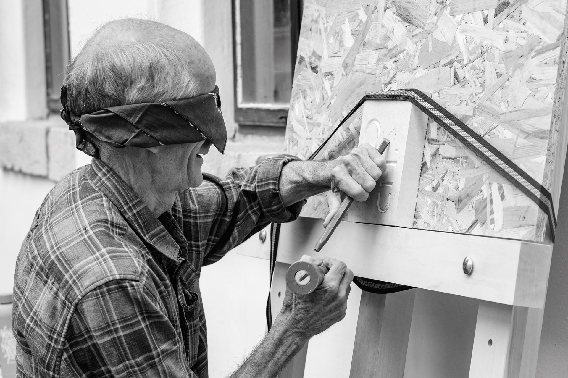

John Neilson demonstrates carving blindfolded — an unexpected and joyful finale to the training.

And then came an unexpectedly joyful finale — a demonstration of carving blindfolded. A playful form in which mastery turned into play, and the serious working process ended with much laughter.
“Stone, Letter, Place — Typocamp Visits Gabrovo” was a meeting about a quiet profession, but its effect was visible: a full courtyard, an attentive audience, questions, a continuation in Bozhentsi, an encounter with local masters, interest from institutions and new possibilities for working with letters in the urban environment.
Work by Krasen Krastev: “Veritas vincit” — “Truth conquers” — from paper composition to carving in stone.
Letters are not only signs for reading. They are part of the way we remember, mark and understand the world around us. Sometimes they are on paper. Sometimes on a screen. And sometimes — in stone, where light and shadow make them visible again. And precisely there, between the memory of the material and the attention to the contemporary urban environment, the question remained: how can this knowledge continue to develop and find a place in the city’s future?

The finale of Typocamp 2026: Stone Carving Lettering in Bozhentsi, with mentor John Neilson, ended with a group photo.

Team and Partners
Meeting: “Stone, Letter, Place — Typocamp Visits Gabrovo”
Initiative and organisation: Rosina Pencheva, Gergana Lazarova-Runkle, Miroslav Penchev, Dobrin Kashavelov / Capturing Creativity — a platform with a collective
In collaboration with: Typo.bg
With the participation of: John Neilson, Boril Karaivanov
Host: Rosina Pencheva
English–Bulgarian interpretation: Kalina Zhecheva
Partners:
Municipality of Gabrovo
Interactive Museum of Industry — Gabrovo
Bozhentsi Architectural and Historical Reserve Museum
Related networks and initiatives:
Homo Faber — a global cultural movement for contemporary craftsmanship
Gabrovo — City of Crafts and Folk Art, part of the UNESCO Creative Cities Network
Gabrovo’s candidacy for European Capital of Culture 2032
Manifesto for the Bulgarian Cyrillic Script

Read more news from our world

back to top